UW Data Science Club / Summer 25'
An admin management tool and end-to-end trivia experience that enhance engagement for 800+ competitors

What is Estimathon?
The Estimathison is Jane Street's signature mathematical competition: a high-stakes, team-based challenge combining trivia, game theory, and estimation skills. Teams have 30 minutes to solve 13 complex problems, with scoring based on interval accuracy and strategic risk-taking.
The Problem
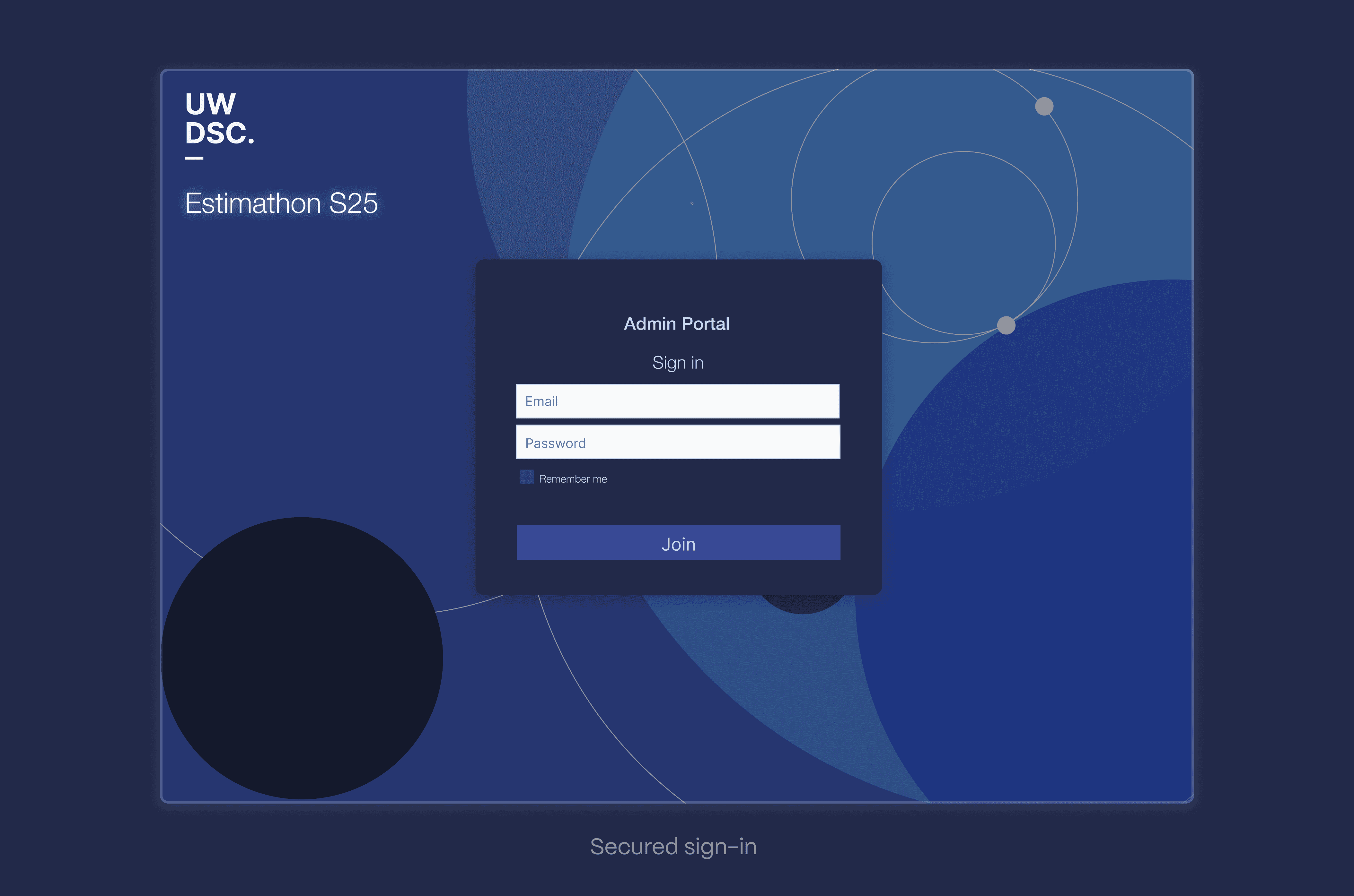
A high-stake game, held through a…Google Form?
As Estimathon grew from a UW Data Science Club event into one of Waterloo's largest technical competitions, its demands outpaced our legacy Google Form setup.

Participants don't know their standing or team progress during the crucial 30-minute window, while admins have zero real-time control over the competition. Juggling Google Forms, email feedback, and spreadsheet scoring creates cognitive overhead and unnecessary anxiety that destroys the competitive experience we're trying to create.
Understanding Two Different Journeys
Having never been or participated in an Estimathon myself, I set out to speak and surveyed with 14 past participants about their experience with the platform.

The Admin Team
No flow control - couldn't adjust timing or release questions strategically
Information overload - needed granular control without cognitive overwhelm
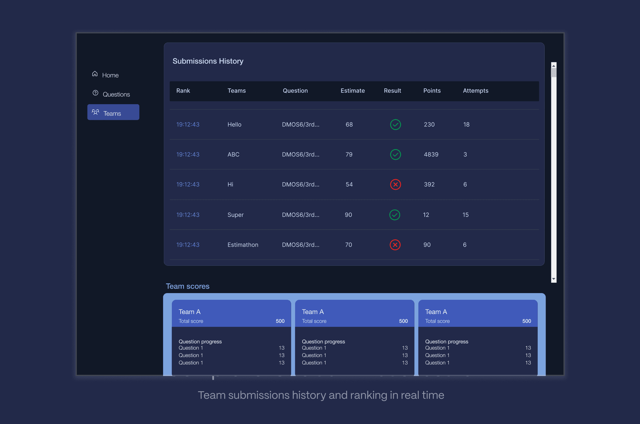
Manual error risk - one spreadsheet mistake could invalidate results
Strategy & Prioritization
Together with the Tech & Development team, we prioritised the features that are essential for the product to function as intended and meet the MVP.


Mapping critical moments
With priorities defined, I needed to understand how these features would work together in real user journeys. The challenge wasn't just designing individual features—it was orchestrating them into seamless flows for two very different user types operating simultaneously.

Low-Fidelity Exploration
For the particpants, I drew inspiration from familiar quiz and testing platforms to create an interface that would feel intuitive under pressure.

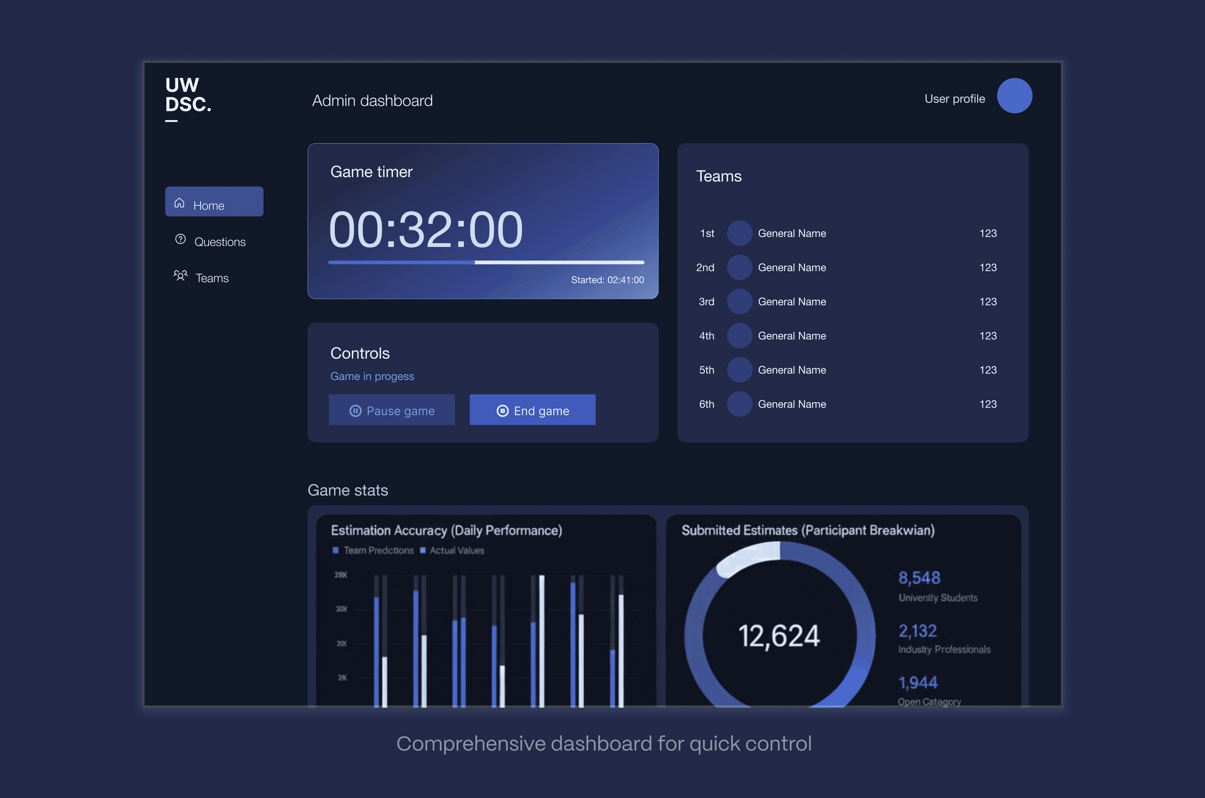
For the admin, a dashboard approach made sense, but the challenge became: how do you provide minute-detailed control without creating information overload?
Using Lovable and Bolt, I rapidly prototyped different structural approaches to test information hierarchy and control placement. This allowed me to experiment with various layouts and combine the most effective elements

I had designed the entire competition experience from the ground up, from participant onboarding flows and real-time competition interfaces.
Don't forget mobile users!
During team discussions, a critical insight emerged: 60% of participants actually compete on mobile devices. I needed to design extra screens that would allow a complete and fulfilling participant experience with mobile-first interactions.
For those behind the scenes
During live competition management, countless scenarios can derail an event. My admin dashboard designs had to account for every possible disruption: technical failures requiring time extensions, teams getting disconnected, scoring discrepancies, and the ability to pause or restart the entire competition if needed.

Measuring Success
Preparing for July launch 🚀
With the competition approaching, I've established success metrics that will validate whether the design solutions address the core user problems
Efficiency
✦ Reduce feedback time from 30-60 seconds to < 2 seconds
✦ Eliminate manual data entry errors
User Experience
✦ Increase participant satisfaction scores
✦ Reduce support requests during events
✦ Improve competition completion rates
Competitive Integrity
✦ Ensure consistent rule enforcement across all teams
✦ Provide transparent, auditable scoring system
──── ୨୧ ────
Key Takeaways
⛓️ Invisible connections of dual-user systems
Designing for multiple user types isn't just about creating separate interfaces, it's about orchestrating experiences that work in perfect harmony. The participant flow needed to preserve competitive focus, while the admin flow required comprehensive control. The real challenge was ensuring that admin actions (time extensions, question releases) translated seamlessly into the participant experience without disrupting their flow state.
🪄 Beyond Static Dashboards
This was my first time designing interfaces where data visualization directly impacted high-stakes decisions. Unlike static dashboards, the admin needed to make split-second choices about competition flow based on live participant data. I learned that effective data visualization is about enabling confident decision-making under pressure.
🚀 Elevating Brand Perception through UX
I realized that user experience design is brand strategy in action. Every interaction, from the moment teams register to receiving final results, either reinforces the competition's prestige or undermines it. A seamless, professional platform signals to participants that this is a serious mathematical competition worth their time and effort.